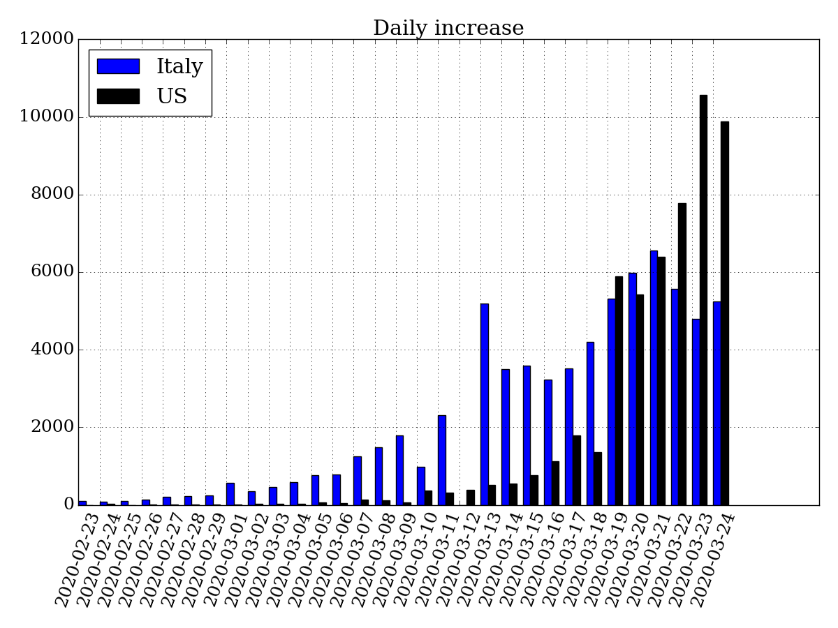
Last days US new cases rate is increased twice up to 10K new cases per day.
[IMAGE: https://files.peakd.com/file/peakd-hive/fooblic/HjqZQgse-increase.png]
Total confirmed cases in US already outrun other countries and could exceed Italy cases quantity soon.
[IMAGE: https://files.peakd.com/file/peakd-hive/fooblic/zLBq1dAQ-confirmed.png]
Data source: CSSE at Johns Hopkins University -> github
Python code using Pandas:
df = pd.read_csv("./csse_covid_19_data/csse_covid_19_time_series/time_series_covid19_confirmed_global.csv")  # new data file

...

def country_increase(name):

    count = []
    for i in range(0,num-1):
        count.append(incr[name][i+1] - incr[name][i])
    return count

count = {}
for country in ("Italy", "US"):
    count[country] = country_increase(country)

index = np.arange(len(data.index[1:]))
result = pd.DataFrame(count, index=index)
bar_width = 0.35

plt.bar(index, result["Italy"], bar_width, color="b", label="Italy")
plt.bar(index + bar_width, result["US"], bar_width, color="k", label="US")
plt.title("Daily increase")
plt.xticks(index, data.index[1:].strftime('%Y-%m-%d'))
plt.xticks(rotation=70)
plt.legend(loc=2)
plt.tight_layout()
plt.show()
Please see my previous post for more details: 1