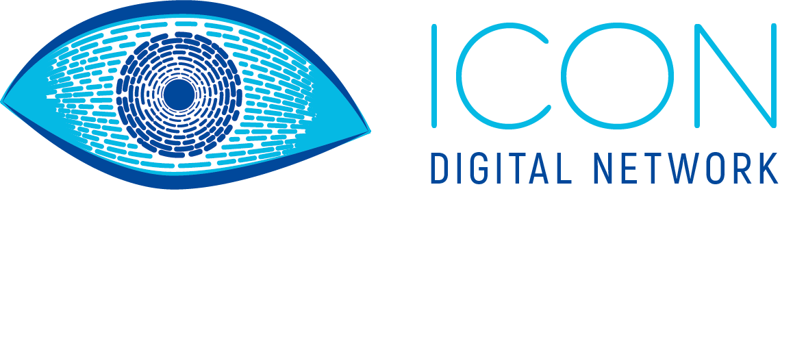
...and can you make it more like icon.... ??? That was one of the questions I got for the first sketch. And here I am back with a new sketch. A little less developed, but this time with a figurative theme, not just pure fantasy. Retained is the style which is like a mosaic or fingerprint. The motif does not get more ICONic: An eye.
[IMAGE: https://cdn.steemitimages.com/DQmefccZWBT79a4Q1LLBDt2TxyQiGwxpUJk785pgb9kH8vs/Logo%20skisse%202.png]
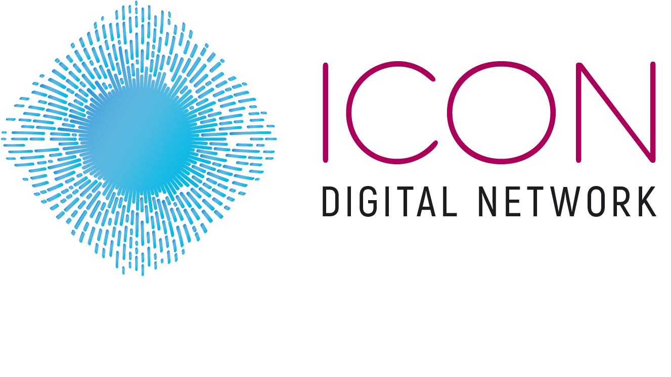
And to refresh the memories, the first one looked like this:
[IMAGE: https://cdn.steemitimages.com/DQmXaCGpRJmhin8k5dMUP4okQLNC8ponEna2811NuPt37iF/Logo%20skisse.png]
A tideous process to work with so many lines, but it sure has something to it since everything gets a unique shape.
The choice of an eye was not coincidental considering what they do. Or what they aim to do.
So what do you say, @everlove? @@quinneaker?