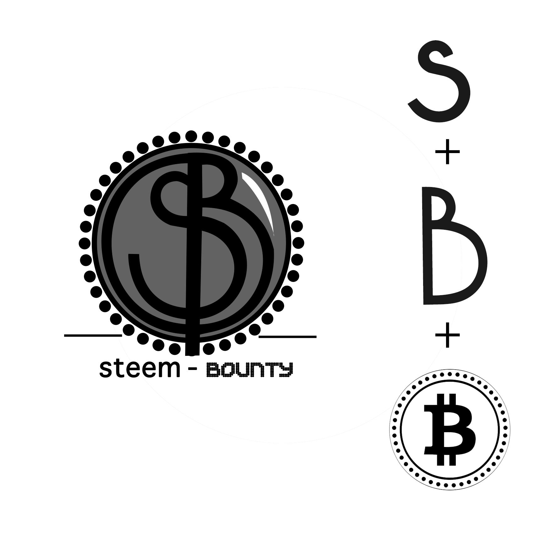
Hi everybody, I will share with you the creative process in the development of a logo design, in this occasion for a contest supported by @steem-bounty.
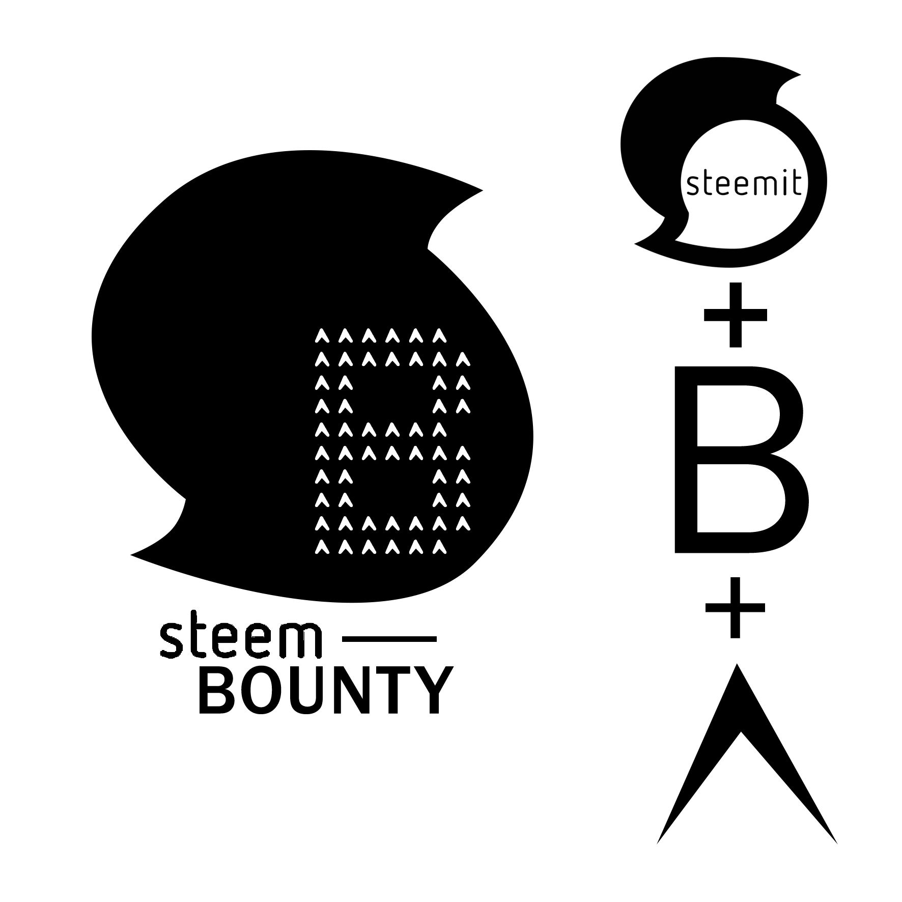
The first idea a got it wasn't really original, I just copied the shape of steemit logo (which is a letter S) and used it as a background for my main tool, this beautiful letter B building with upvoting icons, lovely :-)
[IMAGE: https://steemitimages.com/DQmRR3LPSu1Ty9BYXofKRYcNecJsXEHLyJapXyiZQkkgNbf/B.jpg]
the first equation was something like this:
[IMAGE: https://steemitimages.com/DQmeUEH9aVpqEiDXop3Th7gbtqpFnLHZo8mKtTHg5Gg6yjy/logo1.jpg]
whit the next result:
[IMAGE: https://steemitimages.com/DQmTRx5YJsfkaR3pWjjcaZwPLyKvA3ddTsuuqsGH62rAw3q/SBlogo.jpg]
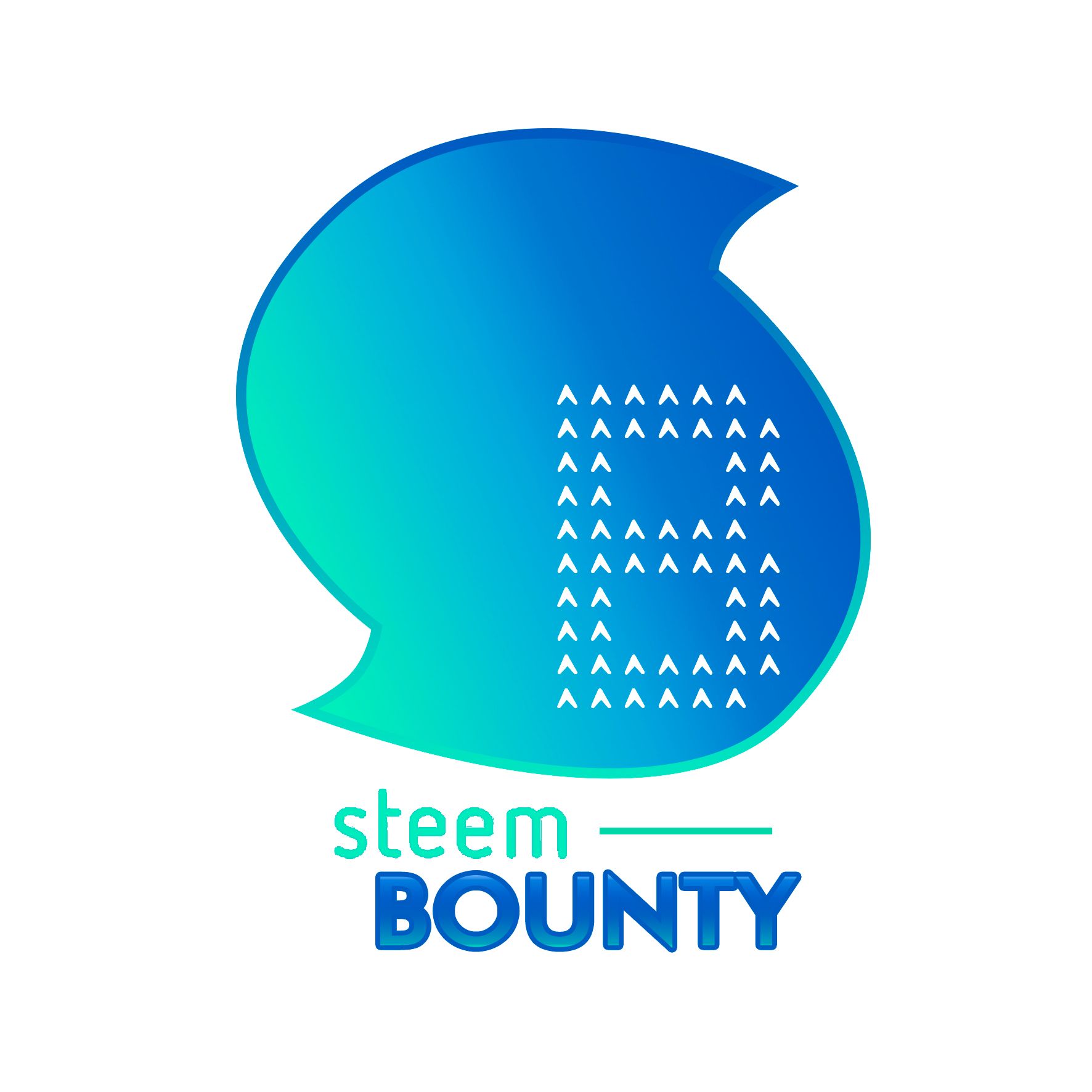
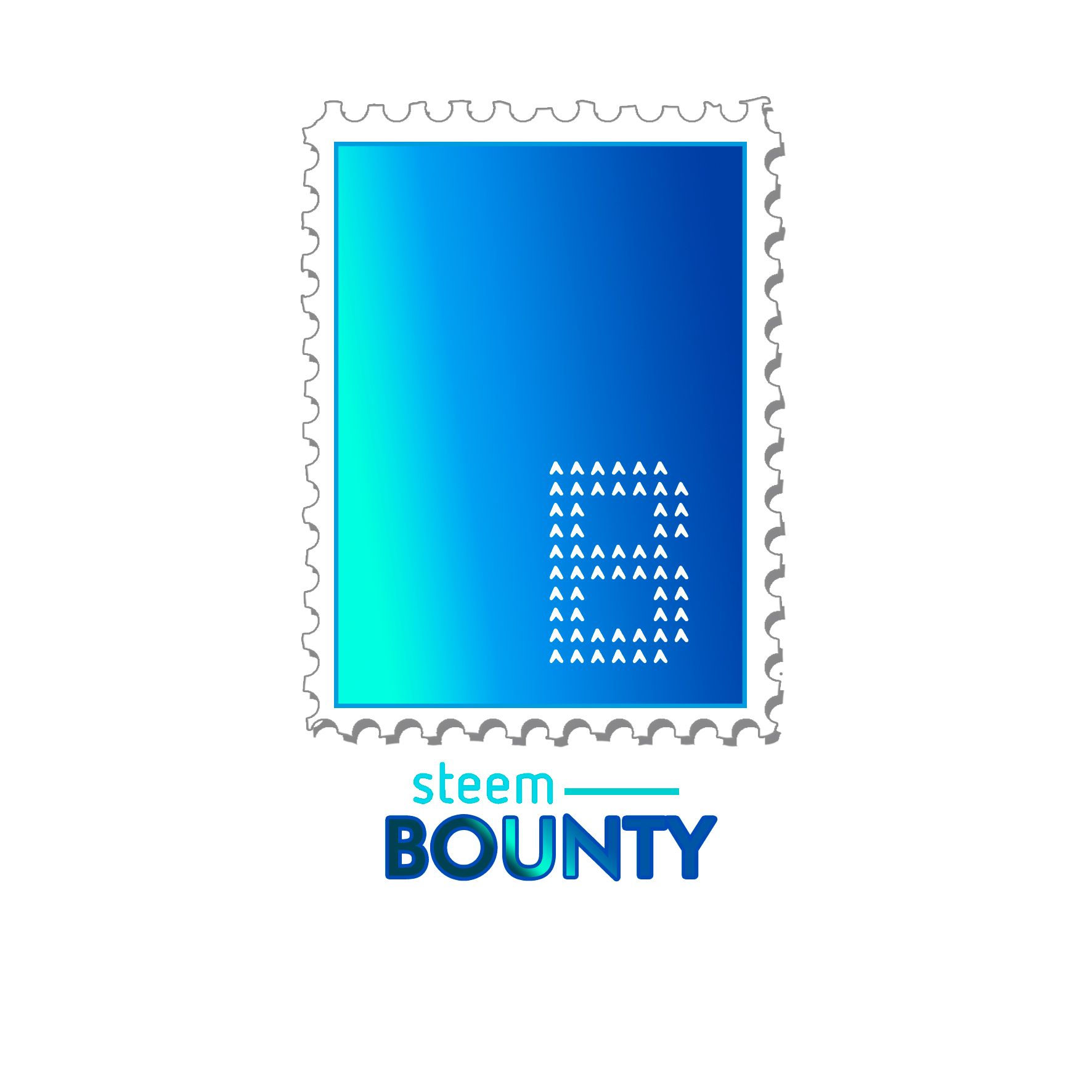
obviously, somebody noticed my mistake and then a new two idea came to help, the post stamp
[IMAGE: https://steemitimages.com/DQmYTj7UeRZpoLGrUb7ig6gagi3aVU8ARs7ihc4vHE2CKq6/SBl.jpg]
and the sphere
[IMAGE: https://steemitimages.com/DQmcDB4oYC9he59sPxbHLymzvQsnofQ9z4s7nJupKahWTAm/SBlo.jpg]
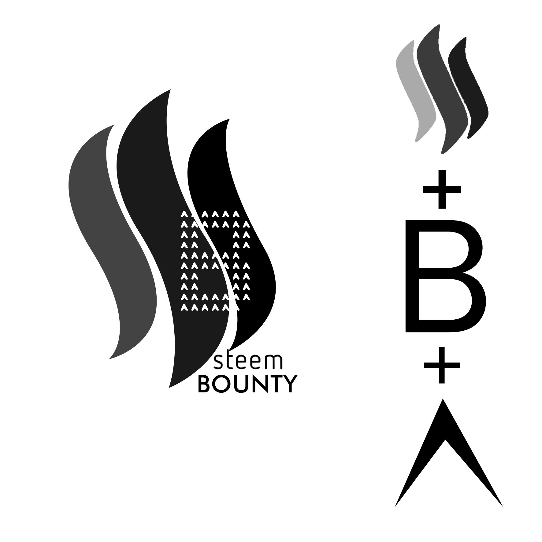
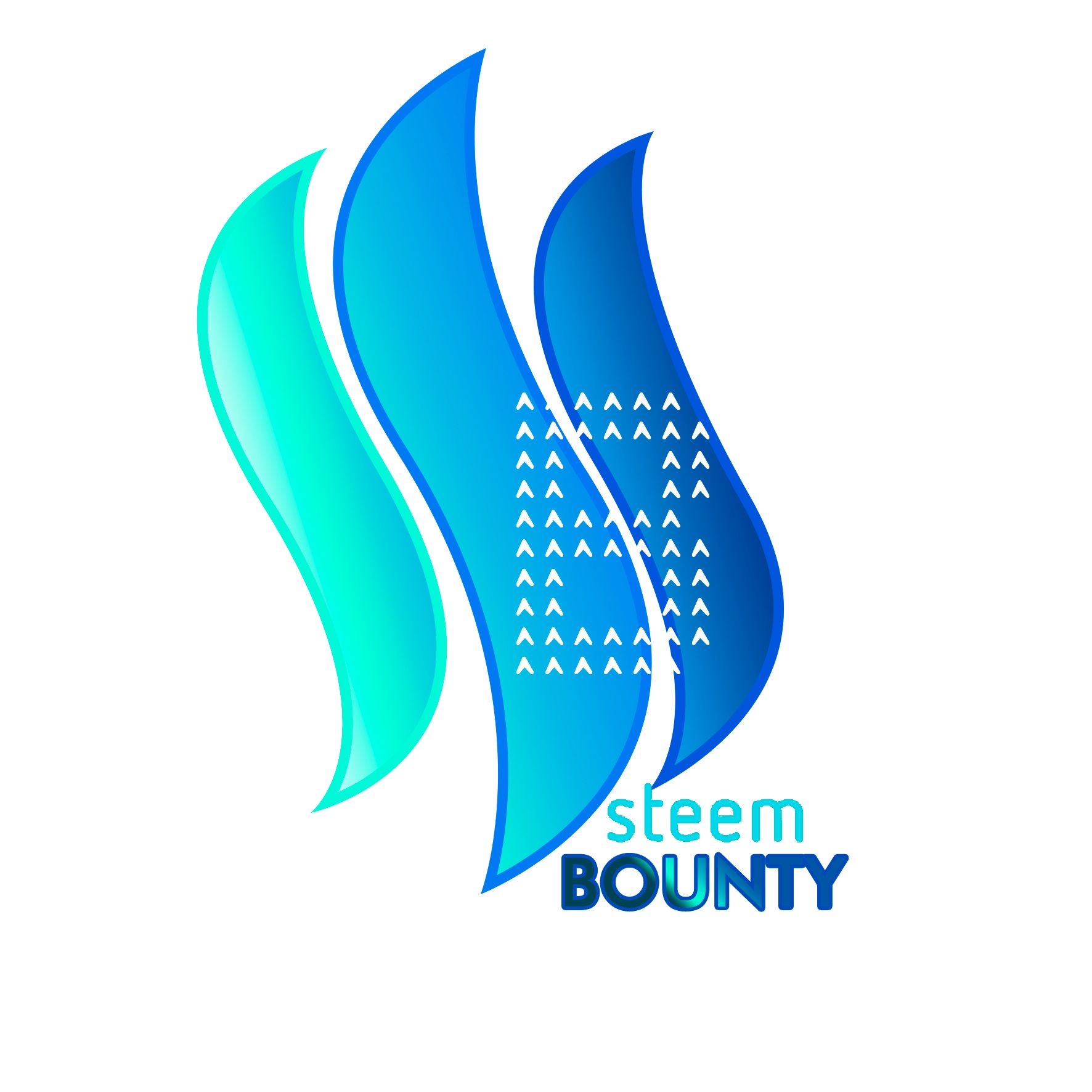
but originally, what people suggested me to do, was to take the steem logo shape and use it as base keeping the letter be in contrast, so I did it, and this is what we got
[IMAGE: https://steemitimages.com/DQmdUb5Ur17UrsSYk3c58KaTdnBQdHBk5o4rAqvE9b1egDK/SBlogo.1.jpg]
so technically we passed from here
[IMAGE: https://steemitimages.com/DQmTRx5YJsfkaR3pWjjcaZwPLyKvA3ddTsuuqsGH62rAw3q/SBlogo.jpg]
to here:
[IMAGE: https://steemitimages.com/DQmT91b5FwnSxK3nKgo3R56AHZenBxQyYnE2YHrzzyvwi6r/SBlogo1.jpg]
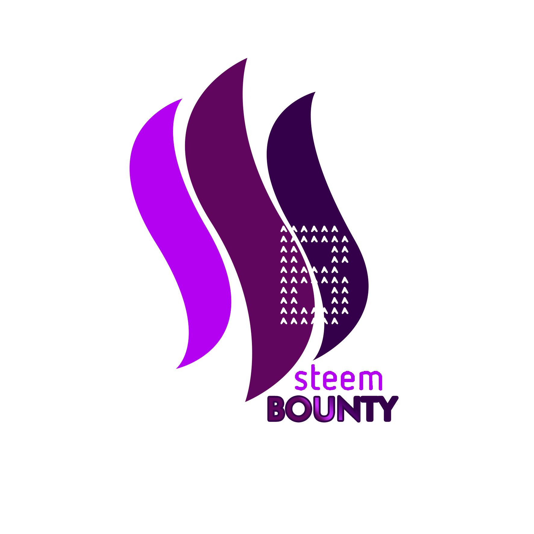
I personally like it, I think blue is amazing for branding, is the colour of trust and confidence, is always fresh and everybody loves it, but the waves make me think on fire and I can't stop wondering how would be to try with a different scale of tonos, so let's see
[IMAGE: https://steemitimages.com/DQmQgHWGHFPNcNi9dy7YzvMwDRKuteE1qVEzLRFKySAaPCo/SBr.jpg]
I'll call it Steem-Bounty on fire :-D
[IMAGE: https://steemitimages.com/DQmdP8mGdaoafxqRXNEKxRXTtrTK9teY3WjACxfsxecHBbD/SBv.jpg]
purple is not bad either, but gree is my favourite colour, so I had to try it
[IMAGE: https://steemitimages.com/DQmXBusPe7SamRGLmPmzYbYCzqohKi3h8wXPNozzVzcP9un/SBg.jpg]
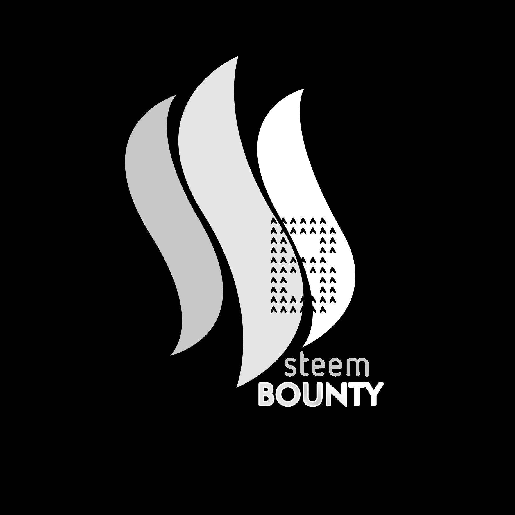
so that's the story with this design, the first suggestion, to conclude it here is the negative of the logo
[IMAGE: https://steemitimages.com/DQmcRoyfUHije26a48yh5zPitWTAFDZCE5jNFHfihvuxzm3/SBn.jpg]
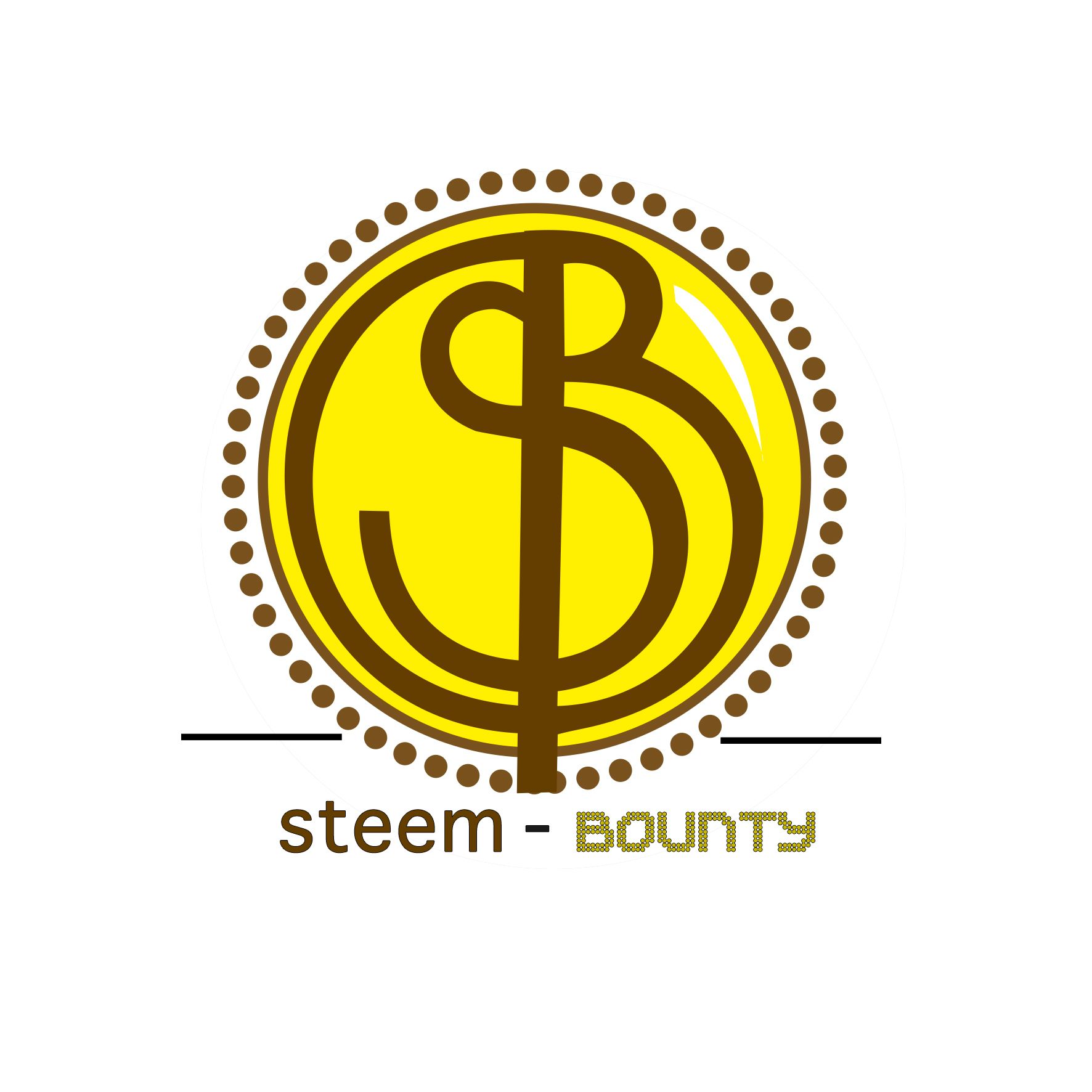
GREAT! Now, the second idea was inspired by coins, what limitate me a bit for picking colours
[IMAGE: https://steemitimages.com/DQmY4W4naPjuEeXCMzihEVz1RAwU6nY4vB9JKQwZQAtoSAi/logo2.jpg]
and the process
[IMAGE: https://steemitimages.com/DQmcu9vcuN5b3Ezr8cr3sHrgrbXSZcU2ipzHrAPNdsZc3hm/SBlogo2.jpg]
I can not make a coin red or purple, well I can (nothing is impossible in the world of design) but it would be maybe too weird, so in the black and white version, you can see how would look as a silver coin and in the original is the golden coin.
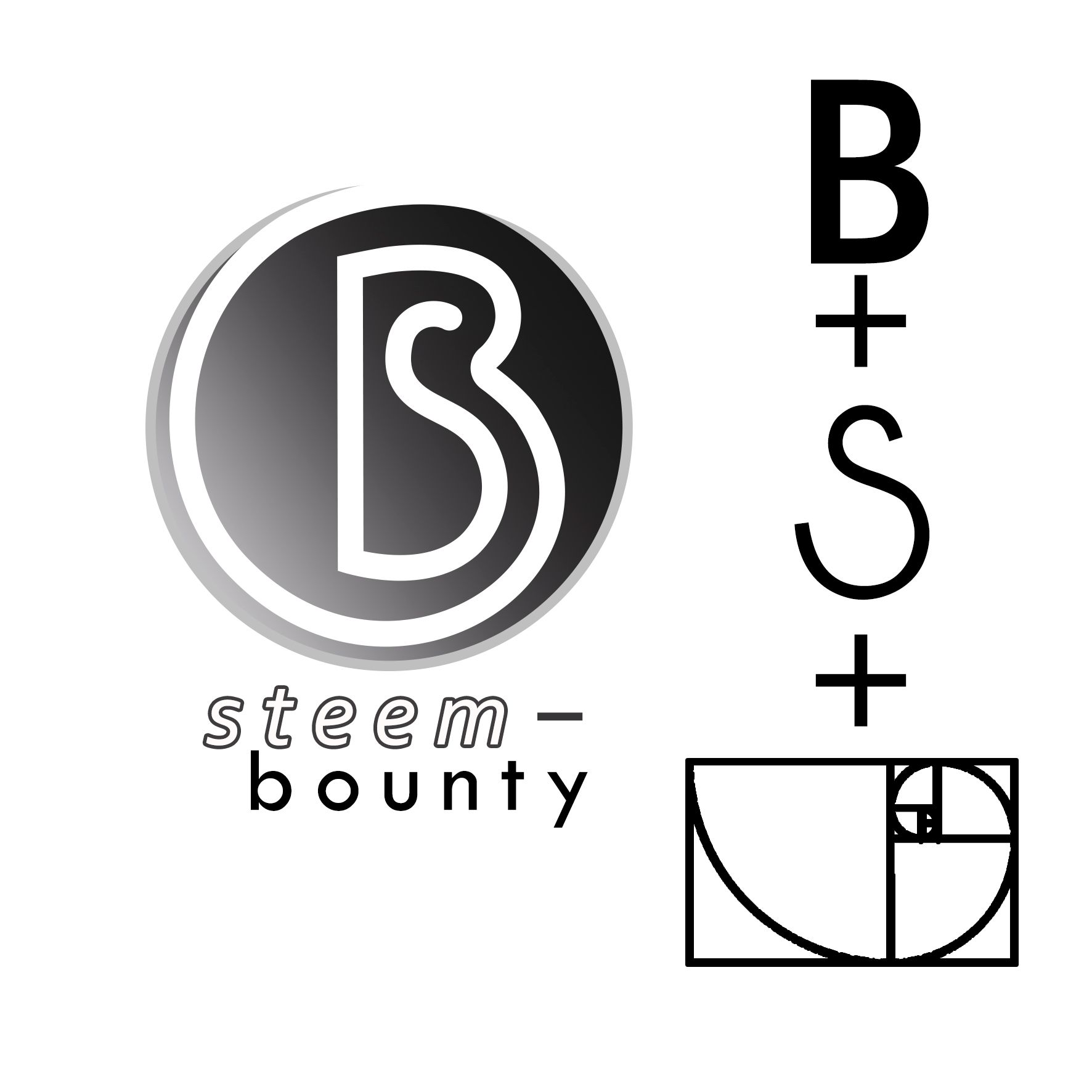
Continuing with round designs, I brought this another idea
[IMAGE: https://steemitimages.com/DQmXErrY7PEyXAGkYiGxjL5FRi1mzXdHy9ianGXGRjam78h/SBlogo3.jpg]
based on Fibonacci principles
[IMAGE: https://steemitimages.com/DQmeTs46pG5UWuFGvs5EeTEDTJfPUQHyKjgThbrhH6YGBhn/logo3.jpg]
somehow reminds me of the joy we get when we write over sand with a stick, as you can see this is a one-stroke design where the letters S & B merge becoming one.
Considering different colour I tried with green
[IMAGE: https://steemitimages.com/DQmYwkc3spNH315wBKnFEvSYnSfRce9QFn5Vaj9RPyGN8Ax/lgg.jpg]
cherry
[IMAGE: https://steemitimages.com/DQmYbmaQkVYA3CsaW4ksg3JUsZPPzVuCoY4Vh4i2DtMNt8R/lgc.jpg]
and indigo
[IMAGE: https://steemitimages.com/DQmRdXQ1KFz66mbwZfk74KFo9Eo3wkV5CfSgL815kYsBiu2/lgi.jpg]
here the negative version of this logo
[IMAGE: https://steemitimages.com/DQmRTKGwvd1gGce5jr8ezxynzKXfneHX17LNqVXhsHTcCRS/lgn.jpg]
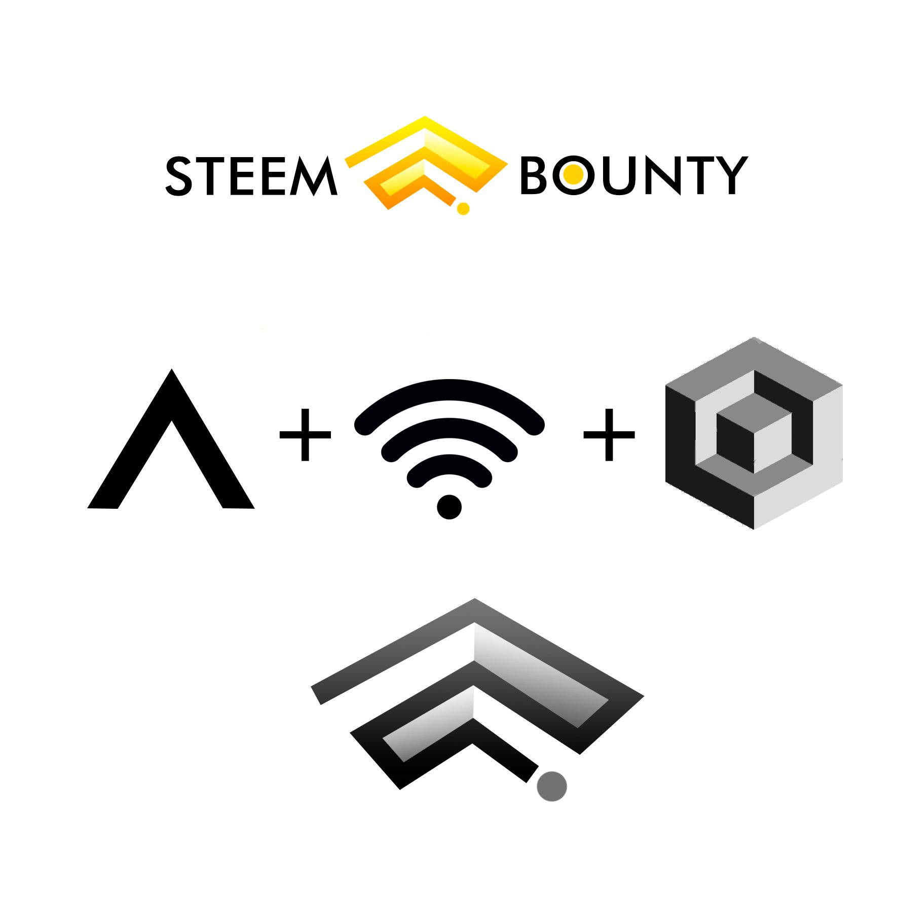
The last three options are not so elaborate, I apologize for it, but I am a little bit short of time, anyway, two of them are inspired by the upvoting icon
[IMAGE: https://steemitimages.com/DQmP3ny16jbXUQppbnsxynBWasUZkfjLBFz2jH3JVxGLbRo/SBb1.jpg]
[IMAGE: https://steemitimages.com/DQmPJhkUdMe6kkBJd91XANqKGoHCvaz7nxiq4d57NZ9HjGn/SBb.jpg]
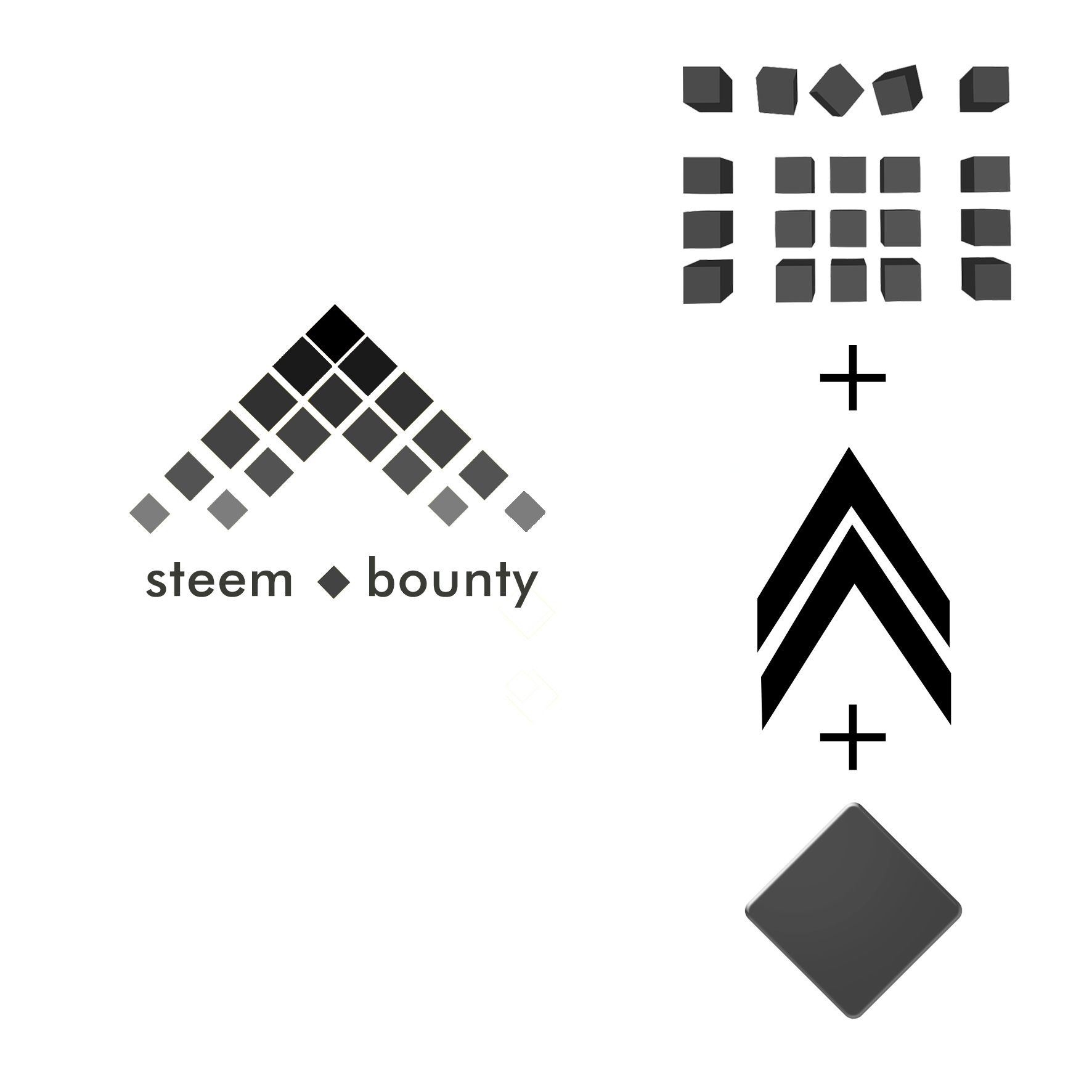
and also the blockchain structure, but, I presented as a group of boxes or cubes that are conected for invisible lines, it is more like a magnetic field that gets week on the edges, try to mix this elements forced me to twisted and realize that the diamond shape (from poker) was a good ingredient in the combination
[IMAGE: https://steemitimages.com/DQmPc4TFG1zD2bjFDVksLXbVJ75SLJD7Y2n1a1hbBKute26/SsB.jpg]
I didn't explore more colours for these ones, somehow I believe they must be yellow
[IMAGE: https://steemitimages.com/DQmdR2RQqyJi4YMdCFCyKdGVhvEnRtXqa39aLjDU73QyVqf/SsBbb.jpg]
And finally, the last design is the poorest one acording to me, the idea is good, but it wasn't proper developed, I know I could do more, but there is no more time
[IMAGE: https://steemitimages.com/DQmWYFeXQ5rpWKA7DJgdkwB8c2dNKZNSfybo6m3neRjFuok/SsBb.jpg]
I have no idea what my chances are for winning this contest, but I feel happy to participate, it was a lot of fun be able do what I love again, at least for a while, I am quite open to criticism an all kind of opinion, thank you for passing by, please don't forget upvote and follow.
See you soon