[IMAGE: https://cdn.steemitimages.com/DQmUV7miVZvyXwexrHdvXt7qbgTPNHcPxzWUkC5GNW6wCrg/1.jpg]
Repository
Details
Websocket is a python based library. Provides library for building websockets servers and clients.
Issue
Pull-request
Presentation
[IMAGE: https://cdn.steemitimages.com/DQmQY3xbn5TqNsJWjjQmxFwmT7k2xmBR7J59GowCxbL3Uo2/2.jpg]
[IMAGE: https://cdn.steemitimages.com/DQmSLdxHgiH74C23PTKVVzLvoUDsfo2A28yt3gYApHhab4P/3.jpg]
Mockup
[IMAGE: https://cdn.steemitimages.com/DQmXjDGTTsrfkyEPCrzkoyutRHqPLFqQqzE1qZcDbKTa9XF/mockup.png]
[IMAGE: https://cdn.steemitimages.com/DQmPYAZzaybdrvbiY5oHE5k5aNYZ4naDZHNXXrkDgZ4R3aE/mockup3.jpg]
Benefits and improvements
[IMAGE: https://cdn.steemitimages.com/DQmXdcQD7GPwWrSXXAd1GaCUaoLS3aGrXtWSEZU4Yp1FxbF/mockup2.jpg]
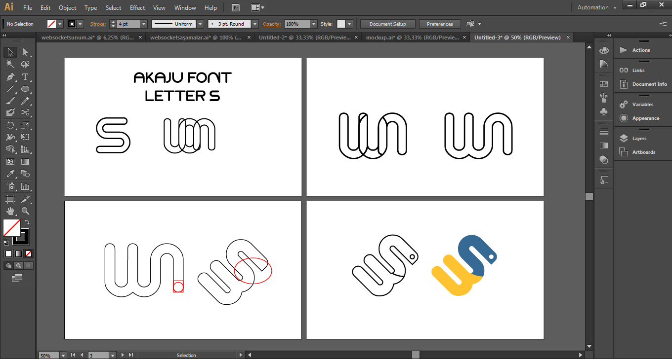
The old logo was created of the initials of the project. But I thought it was inadequate. The project is a python-based. Therefore, I used both initials of the project and i also represented the python. Also, used the original python color to i emphasized the idea better. Finally I chose a round font to provide icon and font integrity.
- more modern and simpler
- compatible font with icon.
- meaningful colors
- represents the project better.
Proof of authorship
[IMAGE: https://cdn.steemitimages.com/DQmeH3BpmGAoRaRBq4wRYdpoB7pE99h6SkVQP1ngnEm6Fnx/proof.png]
Tools
[IMAGE: https://cdn.steemitimages.com/DQmd3AT1CZNAvqd8C7DptTTrVtdSvVx3yKKC15YBKUMRhzZ/ai.png]
Original Files
Google drive
Font
Font
Mockup Source
Proof of Work Done
Github profile
[IMAGE: https://cdn.steemitimages.com/DQmNNG7wKmGGt4wzpbEQPNYLaoQMQXNAFY9Brkz3KLqQ66K/image.png]
This work is licensed under a Creative Commons Attribution 4.0 International License